03 / Product + brand design · Aug 2025—Apr 2026
Rill
Insights
A publicly launched identity and product-facing brand system for a human-centered research and design studio.

The brief
Make a complex service feel clear, credible, and unmistakably its own.
As Product & Brand Design Specialist, I developed an expressive identity system and business-facing collateral that could communicate the studio's breadth without losing its human-centered point of view. I independently created the final two-bird mark and carried it into a public-facing redesign.
Identity redesign
From illustrative
to ownable.
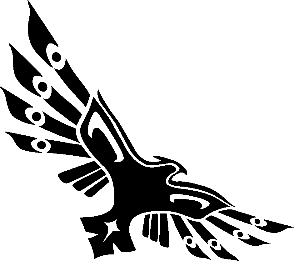
An original two-bird mark I designed independently for recognition, scale, and flexible application.
Exploration
Finding the signal
inside the symbol.
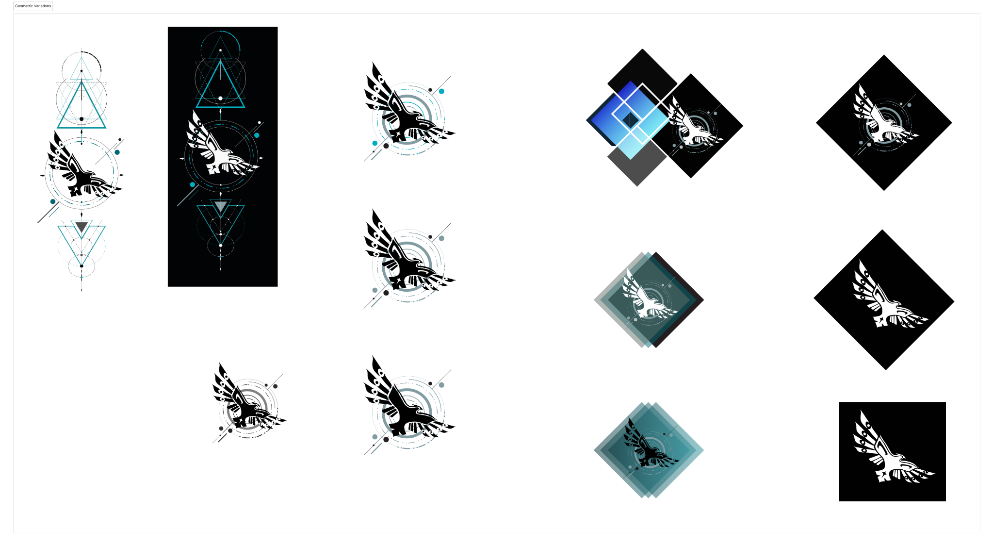
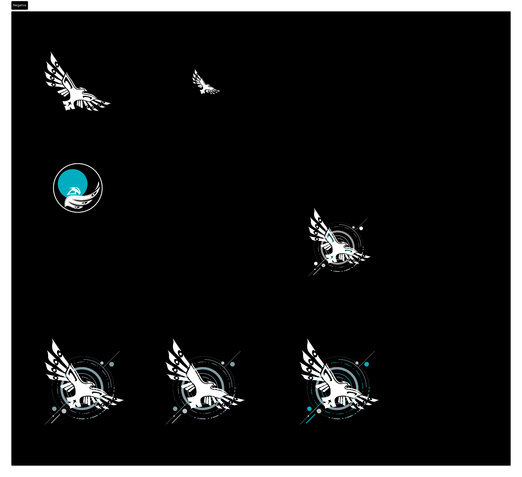
The design process moved from layered, geometric compositions toward a simpler silhouette. Circles, diamonds, and orbiting lines tested the relationship between research, motion, and perspective before the central bird mark was allowed to stand on its own.
The system
Built to stay recognizable at every scale.
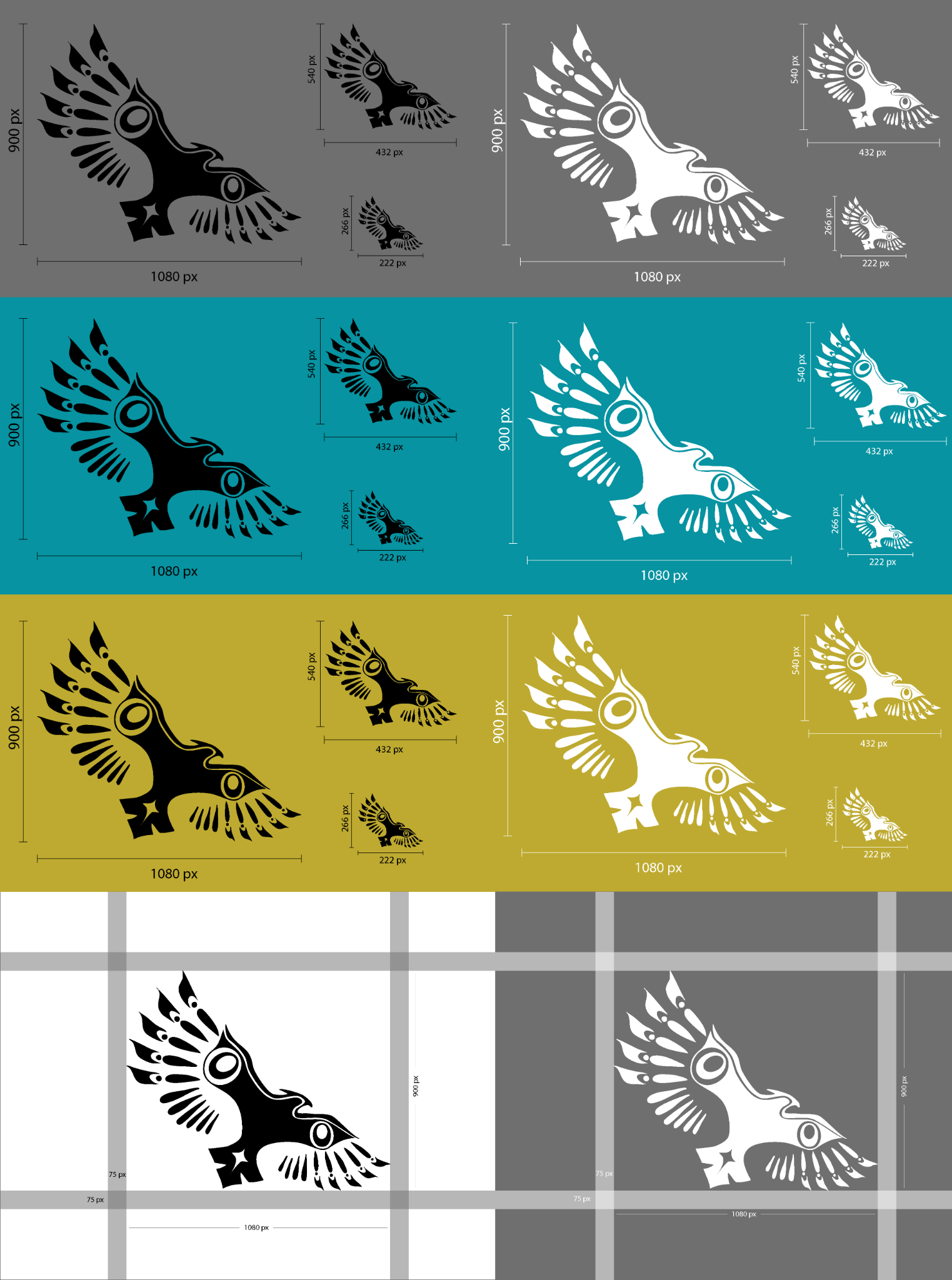
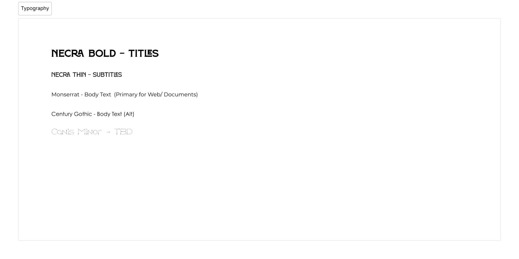
The final family includes positive and reverse marks, compact variants, clear-space rules, and a teal-led palette that can shift between quiet business communication and high-contrast presentation environments.
Applications
One identity.
Two different jobs.
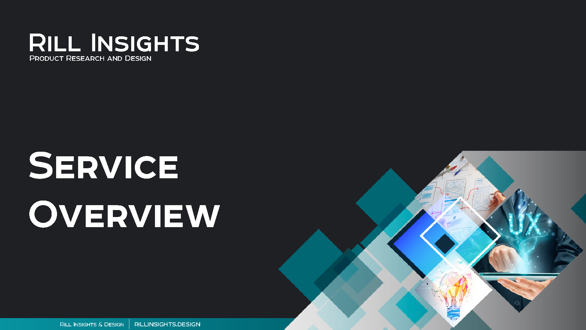
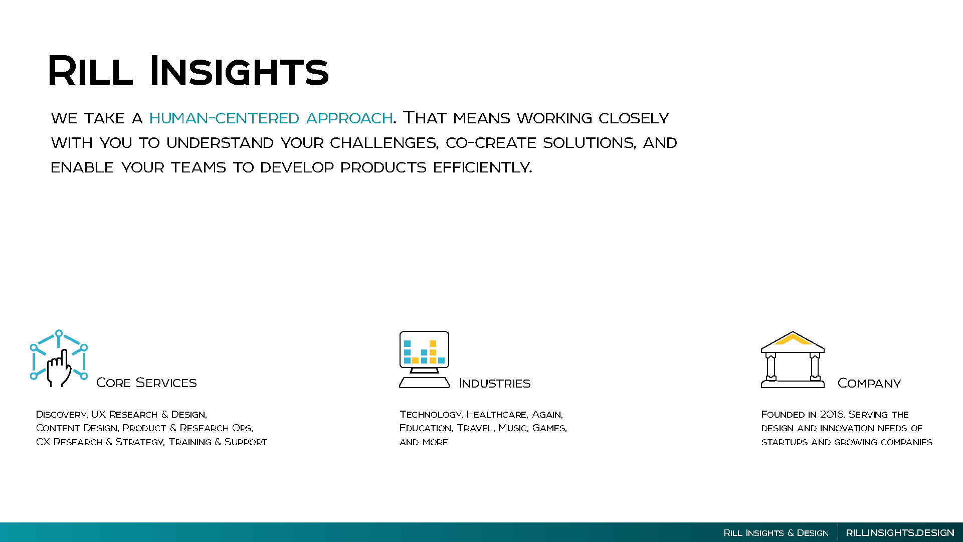
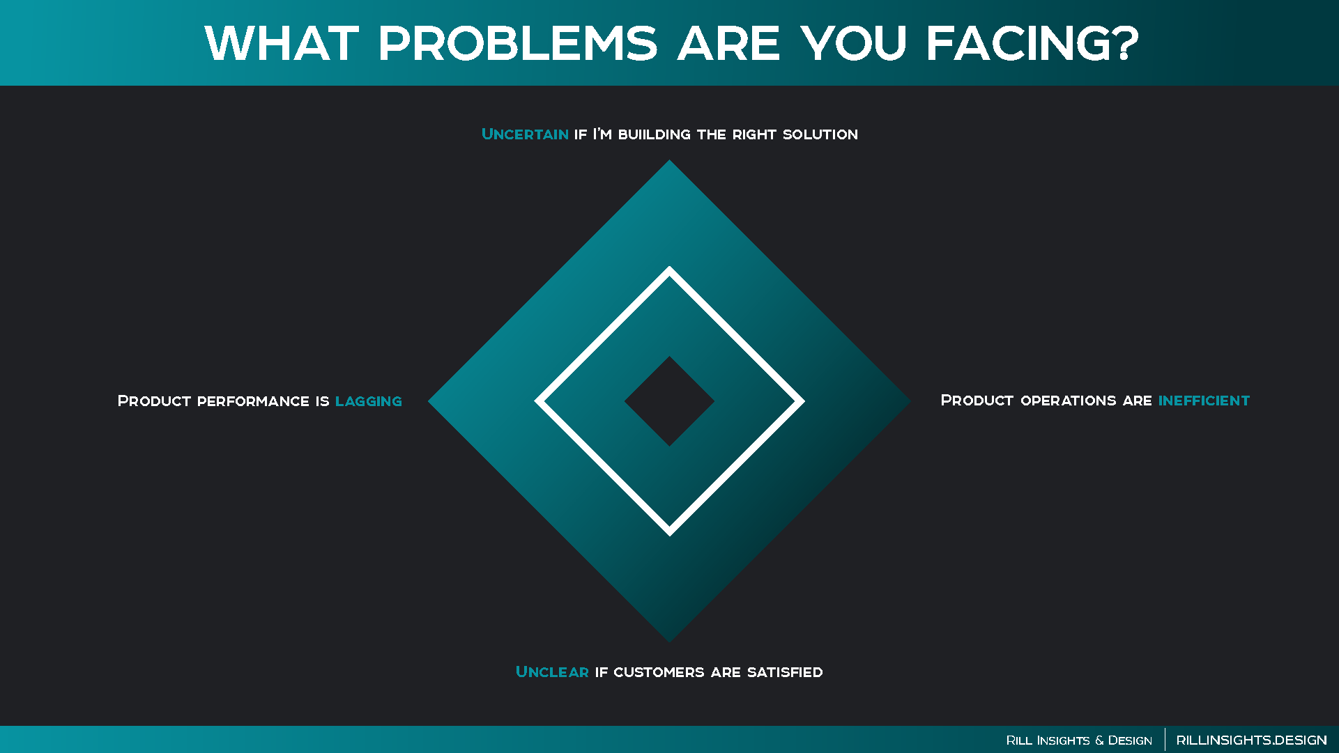
The system had to explain services in a presentation and sell the studio in a single page. The same visual language carries across both—without forcing every format into one rigid template.
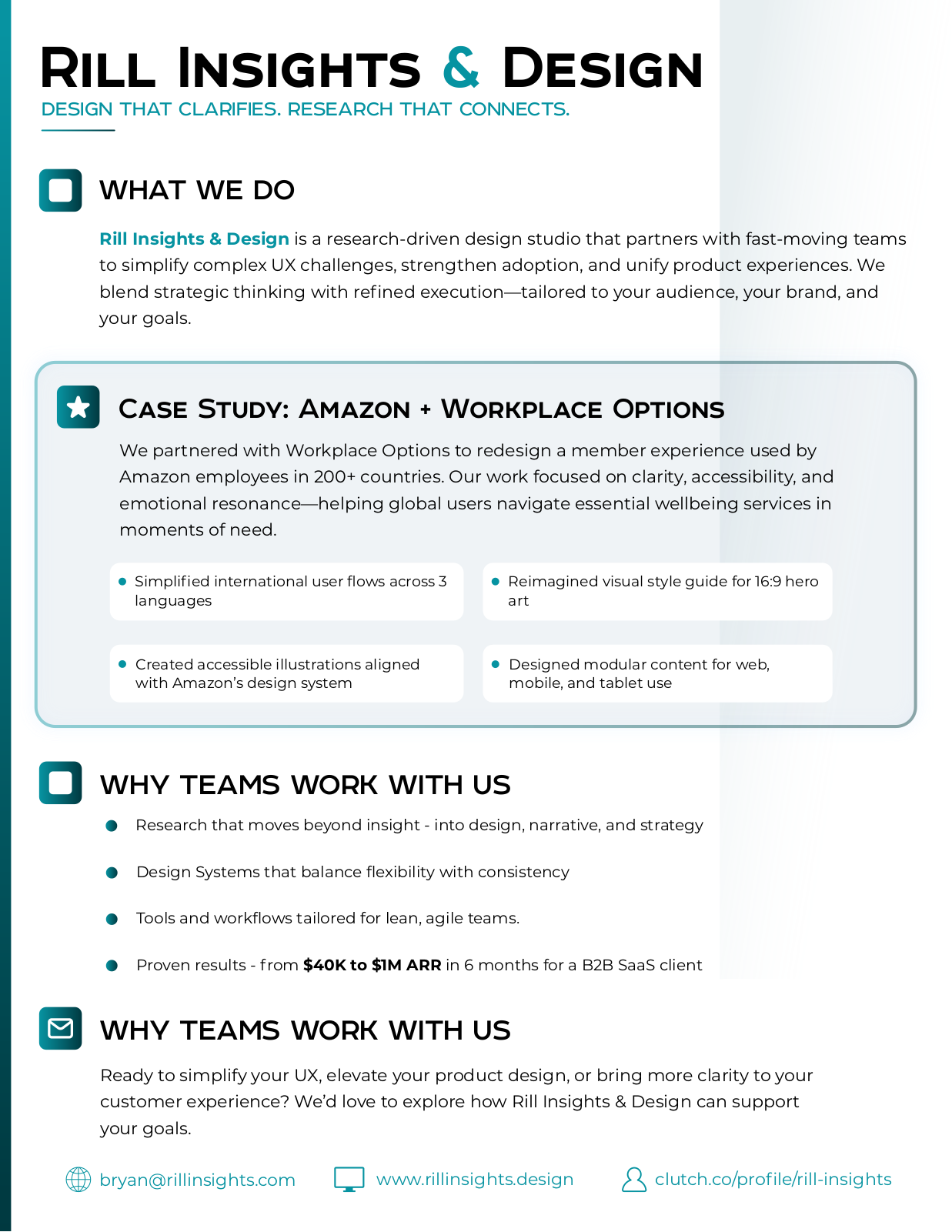
Convention one-pager
A complete studio story on one page.
The final sheet combines positioning, services, and a safe-to-share Amazon + Workplace Options case-study proof point in a layout designed for fast scanning. The system was adopted in Rill's public communications.
Outcome
A publicly used identity system—anchored by an original bird mark—and sales collateral that gave the studio a clearer, more consistent story.
Next project
PixelPact